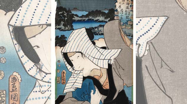
Untitled (Kabuki actor with handkerchief) by Toyokuni Utagawa, early Nineteenth Century, woodblock print. Collection of the Kalamazoo Institute of Arts; Joy Light East Asian Art Acquisition and Exhibition Fund, 2012.22.
By Andrea Valluzzo
KALAMAZOO, MICH. — Of all colors, blue is perhaps the one that holds the greatest influence over our lives. From deep blue oceans and large lakes to azure skies, blue is all around. Whether mined from nature or created from synthetic materials, the color is also one of the most prominently featured in art history across materials and traditions.
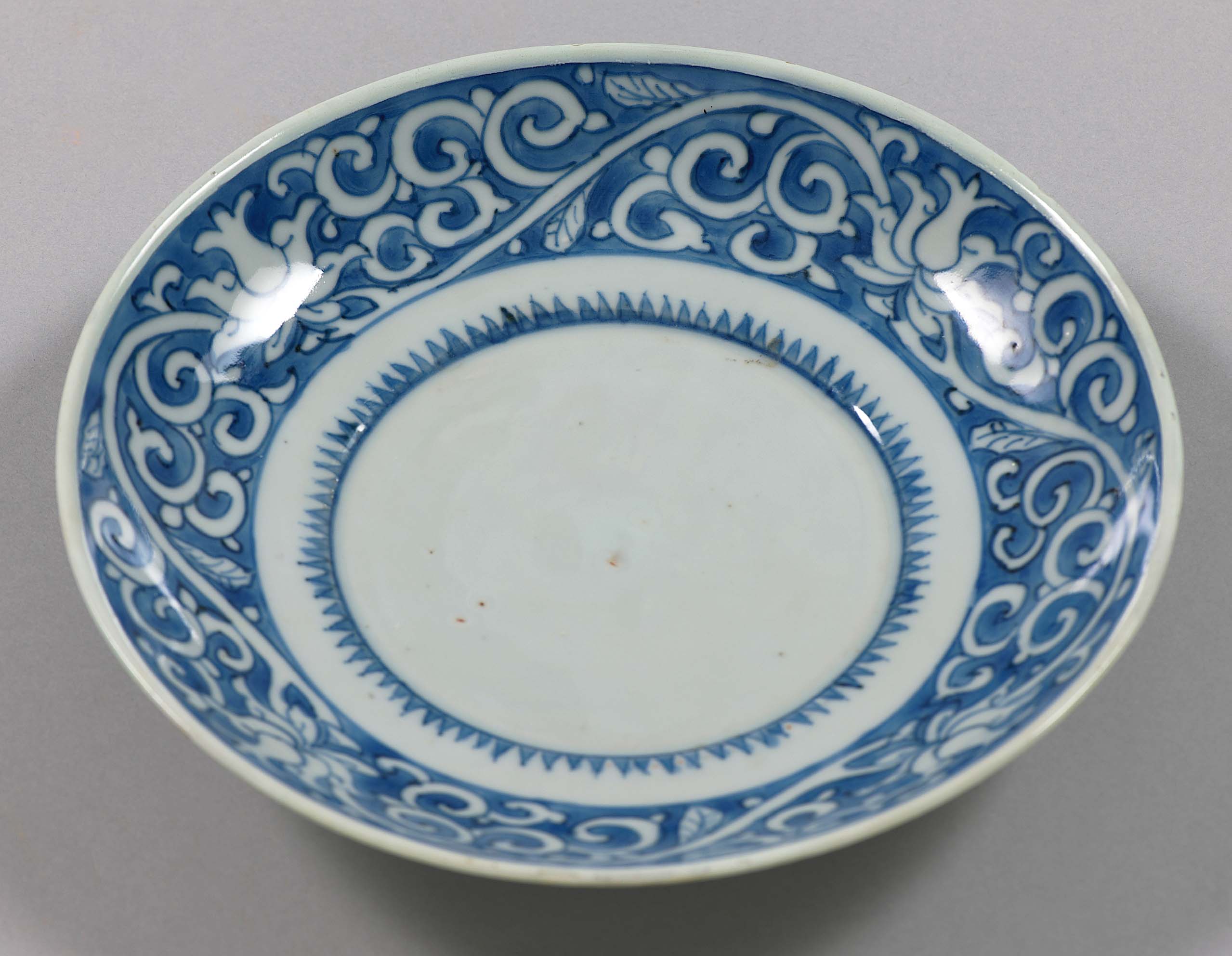
Interestingly, cobalt blue, which prominently figures in blue-and-white porcelain, a style perfected in China and widely exported starting in the Thirteenth Century, was one of the most challenging hues to develop, necessitating precise firing control and temperatures. Cobalt was also ground up to create smalt, a painting pigment. Similarly, indigo and Prussian blue are popular colors that have long been used in artmaking from dyeing textiles to Japanese ukiyo-e prints.
Exploring the rich and enduring influence the color blue has had across centuries of Chinese and Japanese artmaking, the Kalamazoo Institute of Arts presents the exhibition, “From Cobalt to Indigo: The Power of Blue in East Asia,” on view through July 12. Over the centuries in Asia, artisans have utilized wondrous shades of blue from the rarest and most precious pigments to create artful objects that shared East Asia’s cultural identity while promoting East-West diplomacy and exchange of goods. In time, the color became key to the visual identity of both China and Japan.
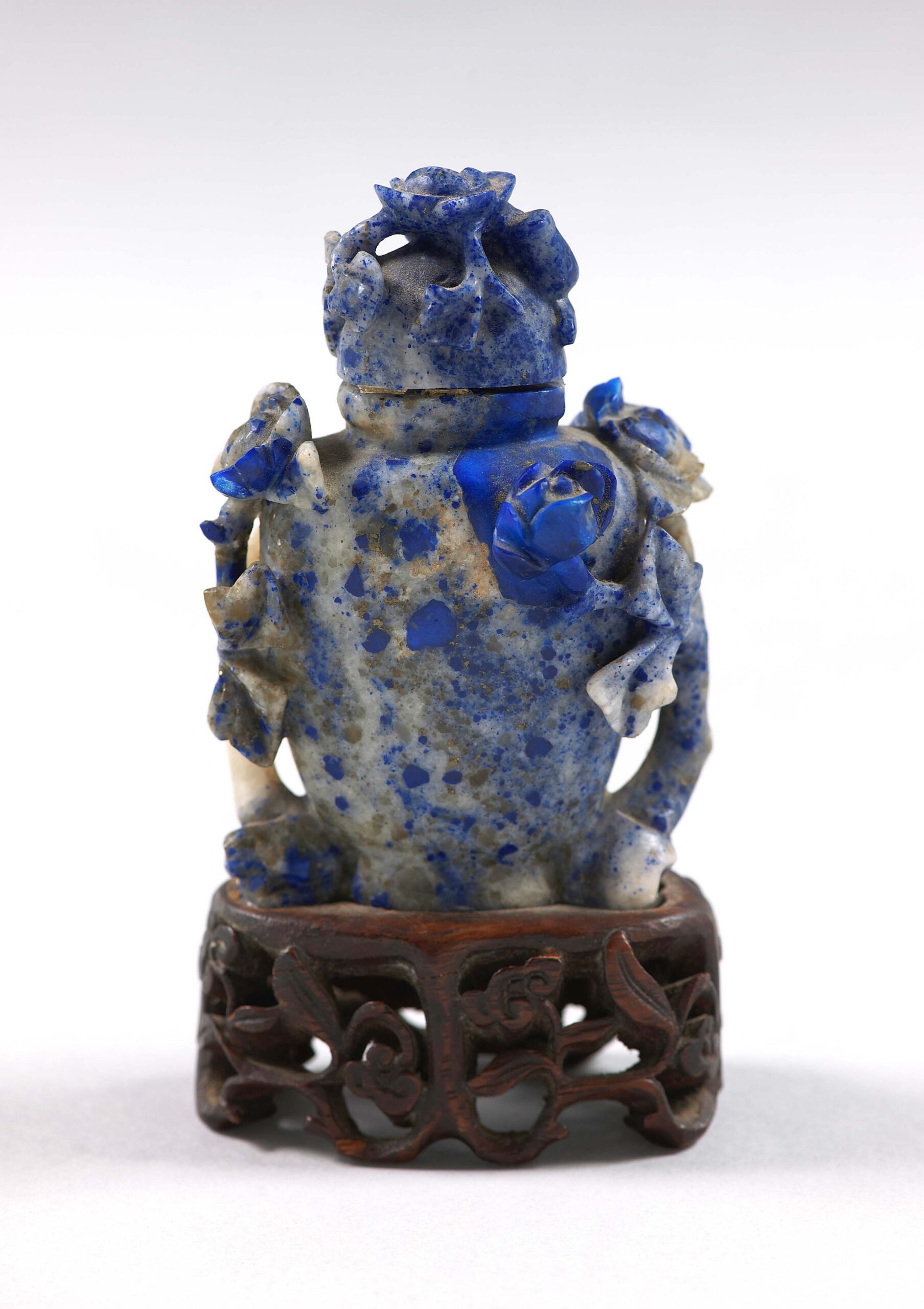
Lapis lazuli snuff bottle with lid, unrecorded artist, Chinese, Nineteenth Century. Collection of the Kalamazoo Institute of Arts; gift of Mrs Dwight Ransom Curtinius in memory of Winifred Upjohn Light, 1973/4.4.8.
The exhibition brings together the luminous shades of cobalt-painted porcelain, the radiance of carved lapis lazuli and the bold Prussian blue of Japanese ukiyo-e prints. In seeing the Institute’s permanent collections in a new light, audiences will gain a new appreciation for the color blue that they might have given little thought to before. “From Cobalt to Indigo” aims to explore the symbolism, craftsmanship and the innovative and technical processes that went into the making and artistic use of color, as well as how multicultural influences have shaped its direction. In this vein, the exhibition positions blue as both a material and a metaphor in East Asian art.
The Institute’s associate curator, Katherine Ransbottom, mastermind behind this exhibition, noted that the exhibition, which comprises about 40 artworks, centers on three themes: “Material and Trade,” “Pigment and Artistic Innovation” and “Blue as Metaphor.”
Drawing from the institute’s sizable collection of Asian arts that totals around 700 objects, the exhibition plays to the museum’ strengths: Chinese blue-and-white porcelain and Japanese woodblock prints. Both mediums have long been among Asia’s biggest artistic exports, expanding far beyond the environs where they originated, and each has undergone significant technical refinement, she said.
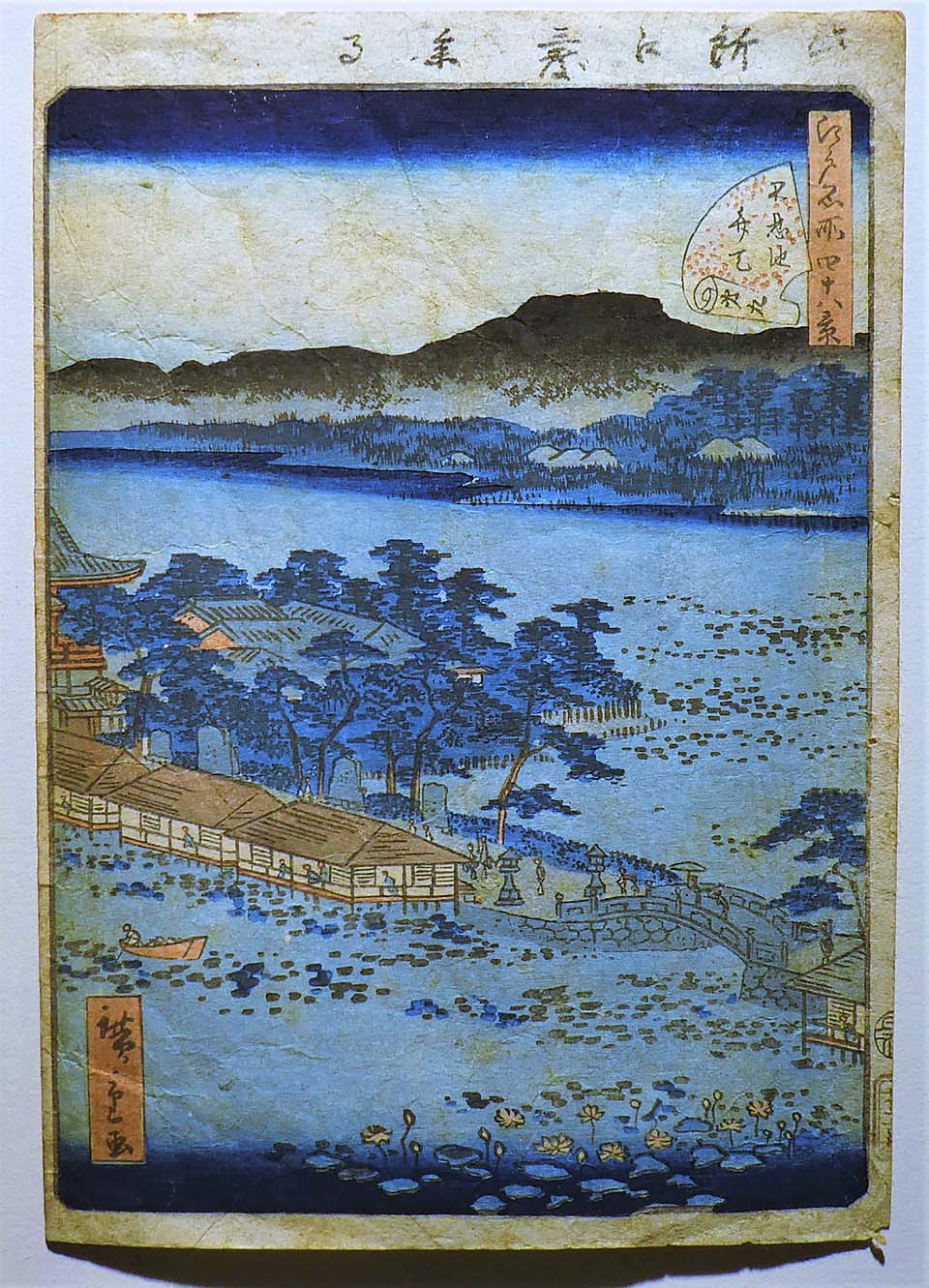
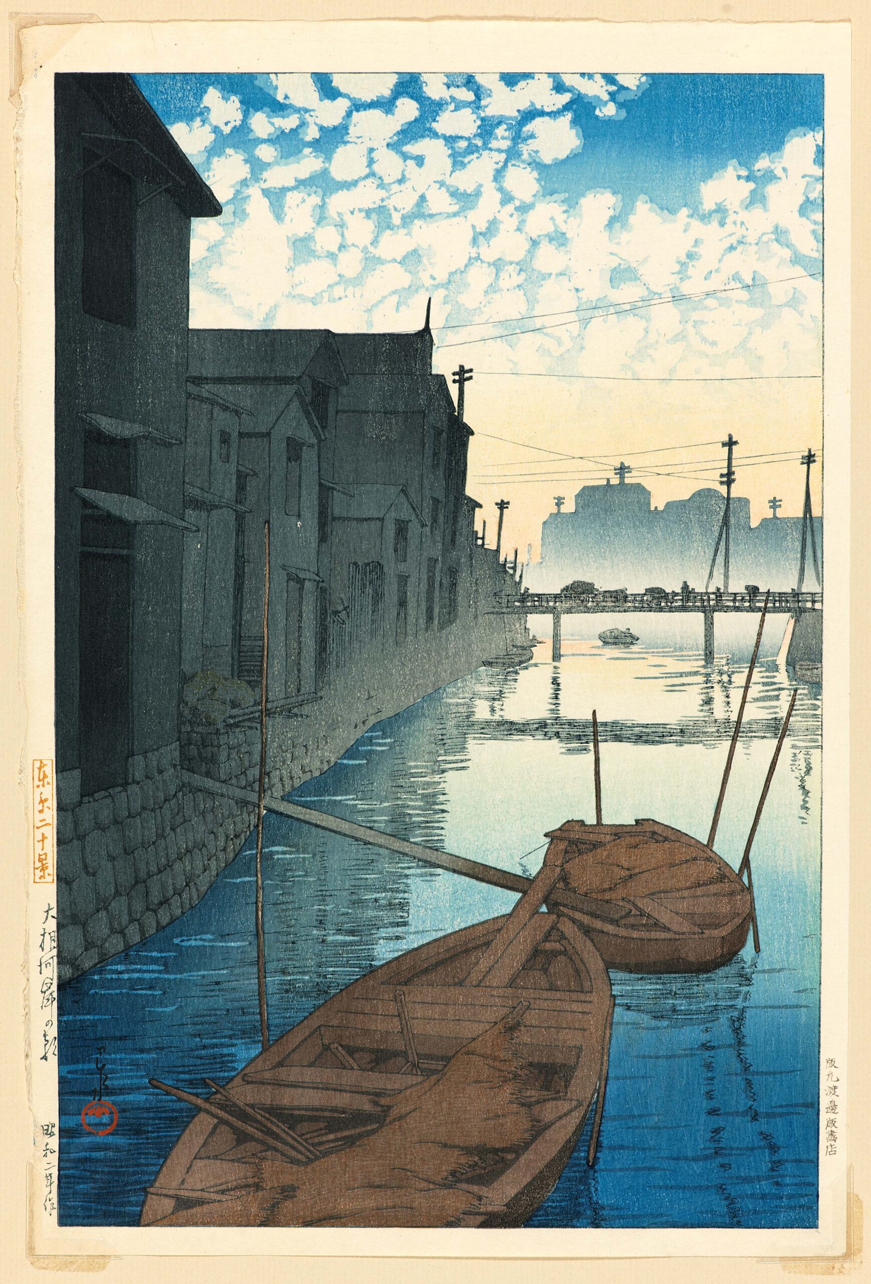
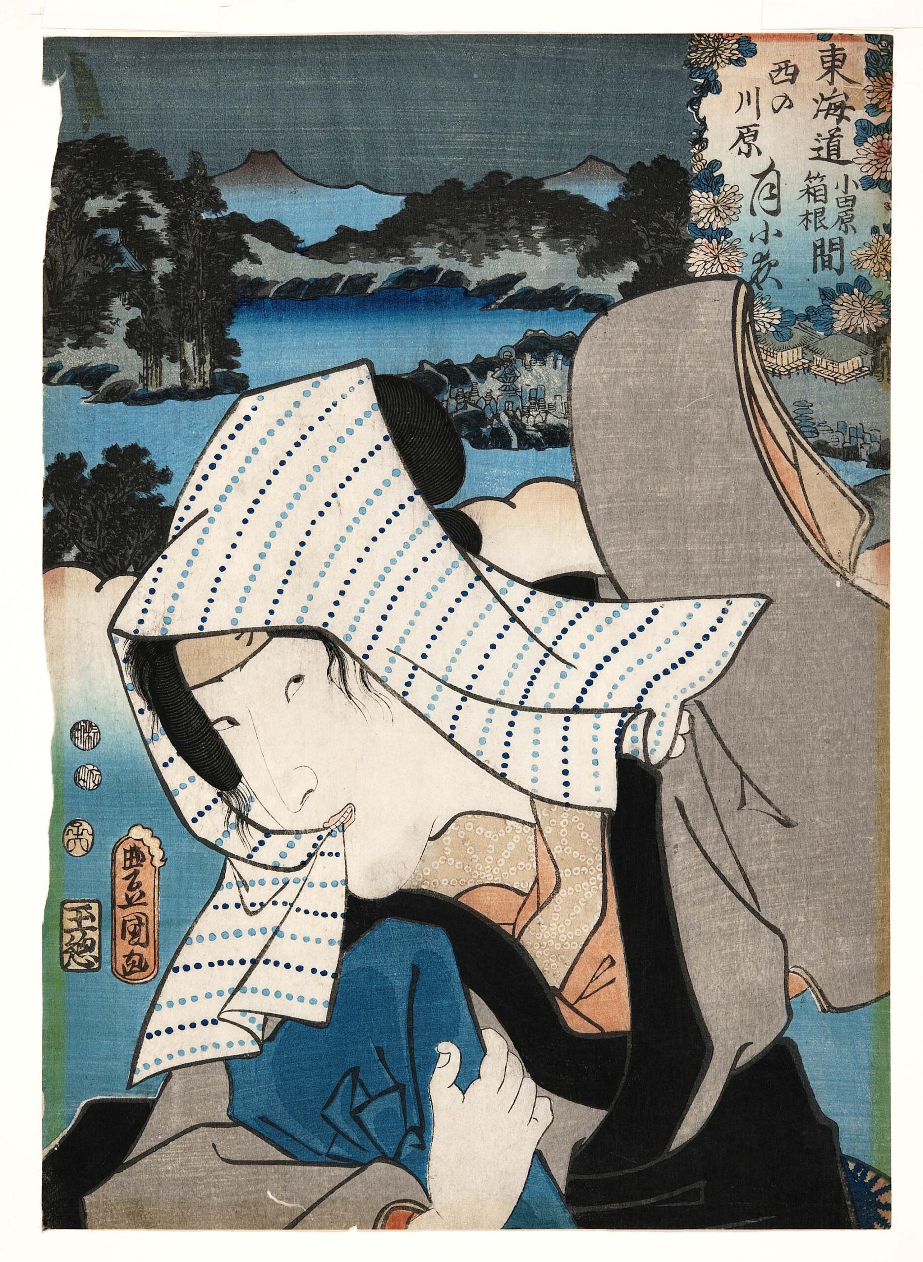
“No. 9, Benten Shrine in Shinobazu Pond (Shinobazu-ike Benten)” by Utagawa Hiroshige II, 1860, multi-color woodblock print on paper; collection of the Kalamazoo Institute of Arts; Gift of The Kirk and Georgia Newman Family, 2021.4.
“When I talk about cobalt, I’m talking about it coming into China and how that first happened around the Fifth Century from Persia,” Ransbottom said, adding that Persian and Arab merchants were some of the earliest to bring this pigment to China. Persian artists had already been using it in porcelain, but their aesthetic was quite different than what was developed in China.
Early Chinese artisans experimented with cobalt in glass production before perfecting its use in porcelain. “Merchants living in China were sort of driving that desire for that aesthetic and then Chinese artists were developing, enhancing and innovating this so they get crisper details,” she explained. “If you look at really early examples, the cobalt lines are kind of muddied once it went through the kiln.” These artists refined firing techniques to eventually develop the crisp, uniquely Chinese motifs that would become some of the world’s most sought-after export products. This cross-cultural exchange came full circle as these porcelains traveled back along the Silk Road into the Middle East and, eventually, into Europe. These cultural interactions add color to the history of Chinese blue-and-white porcelain, and in the Fourteenth and Fifteenth Centuries, China stood alone in creating such standout objects, owing not only to the talent of its artisans but also its ready access to kaolin clay.
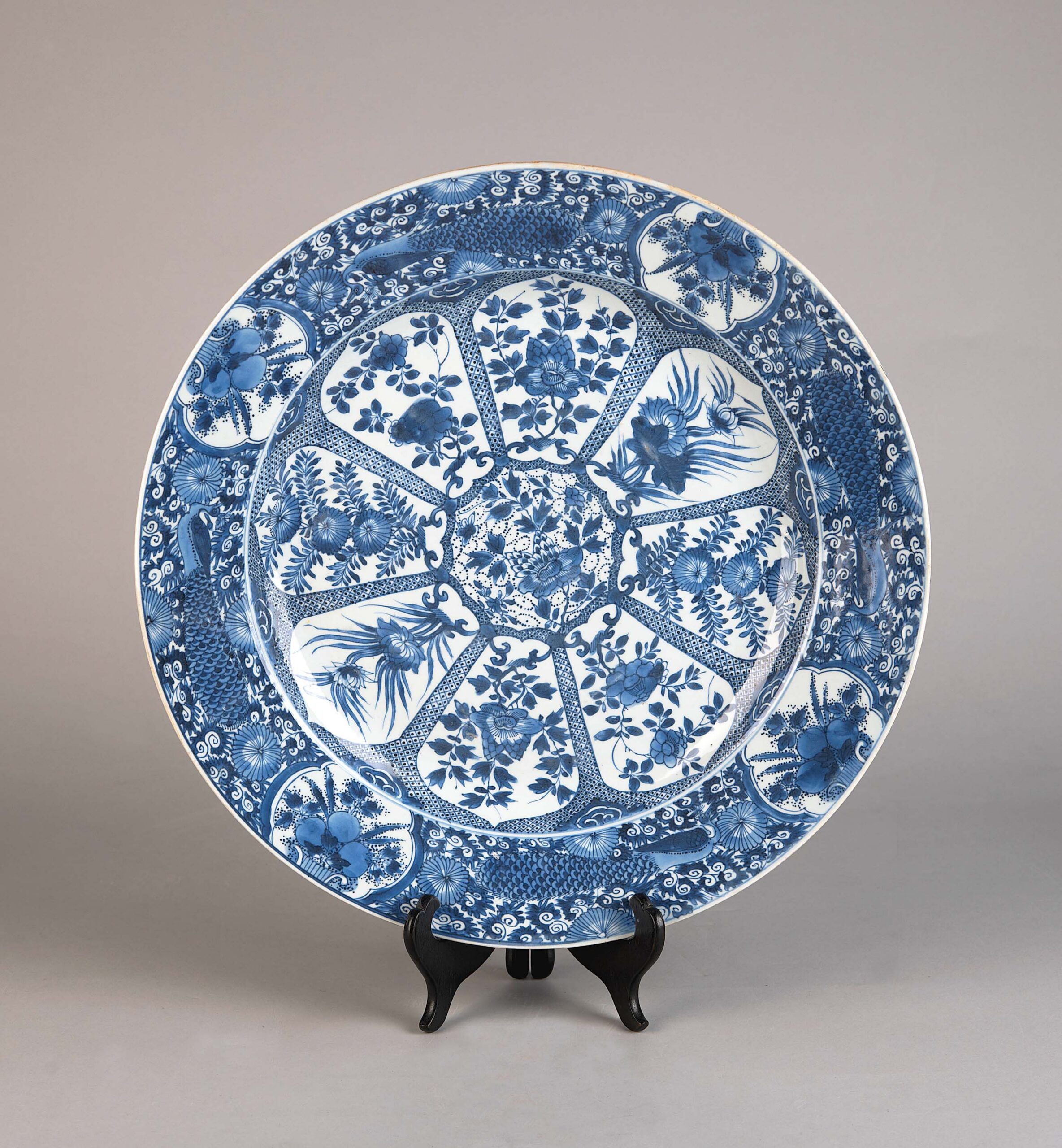
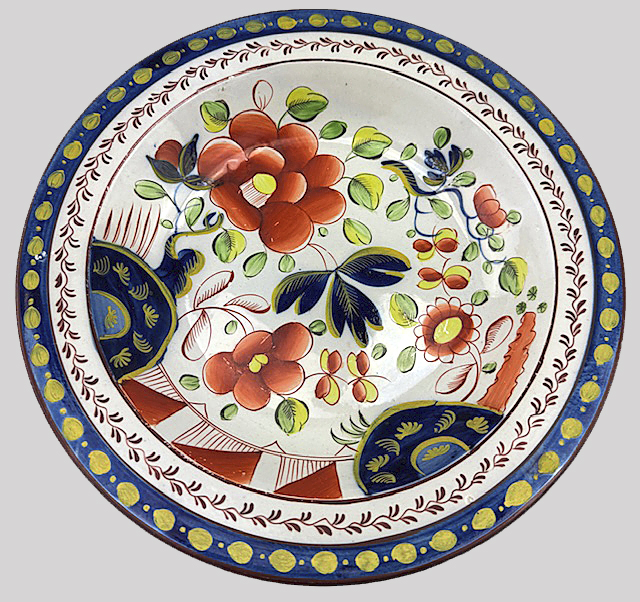
Blue-and-white glazed charger, Chinese, unrecorded artist, Eighteenth Century, glazed ceramic. Collection of the Kalamazoo Institute of Arts; Joy Light East Asian Art Acquisition and Exhibition Fund, 2012.21.
Offering a snapshot view of the global history of blue artworks and objects that could fit in the museum’s gallery would be challenging, but Ransbottom wisely hones in on color to put the focus on porcelain and woodblock prints, thus creating a cohesive exhibition that is both informative and beautiful to look at.
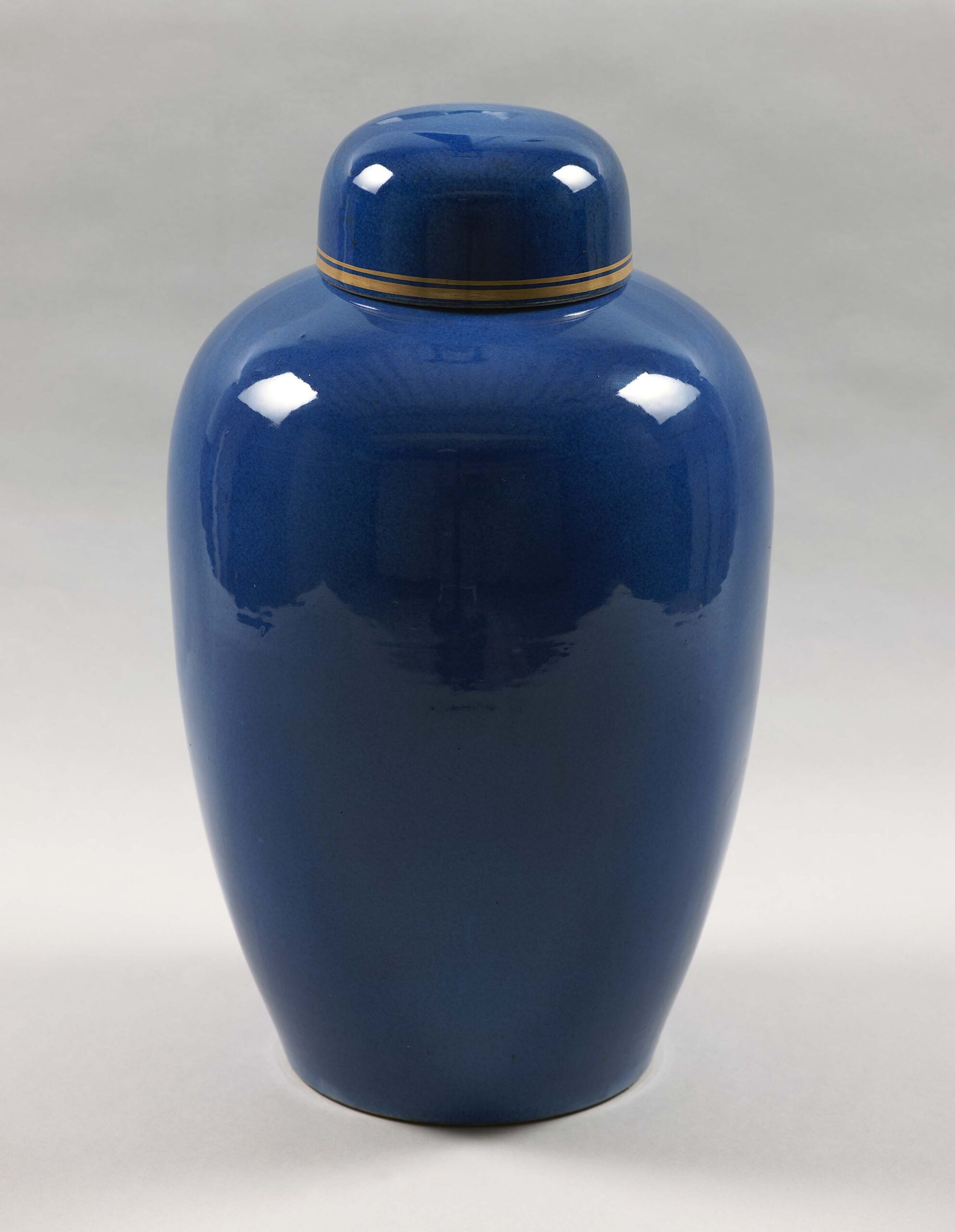
Among the items on display is a circa 1800-1900 warrior jar with celadon glaze and a cobalt blue underglaze, featuring two of the most valued hues in Chinese porcelain. Here, the elegant pale green of the celadon glaze, a tradition that reached new heights in the Song dynasty, pairs well with the cobalt underglaze. The jar is rich in storytelling and symbolism, showing cobalt soldiers coming home after a battle, on horseback and by foot, while the reverse side depicts two blue bats. The bats are an auspicious symbol of happiness and longevity, perhaps a hopeful message to the status of the returning warriors?
While cobalt defined the ceramic world, the realm of woodblock prints saw a different color evolution. The exhibition highlights the transition from natural indigo to the synthetic Prussian blue. Natural indigo, used in early Japanese printmaking, was beautiful but sensitive to light and humidity. The introduction of Prussian blue — a more durable and color-fast pigment — allowed artists to expand their palettes and created a lasting impact on global aesthetics. Blue was key to the visual language of these woodblock prints that introduced new ways of seeing landscapes and life, thus becoming a vehicle of artistic dialogue.
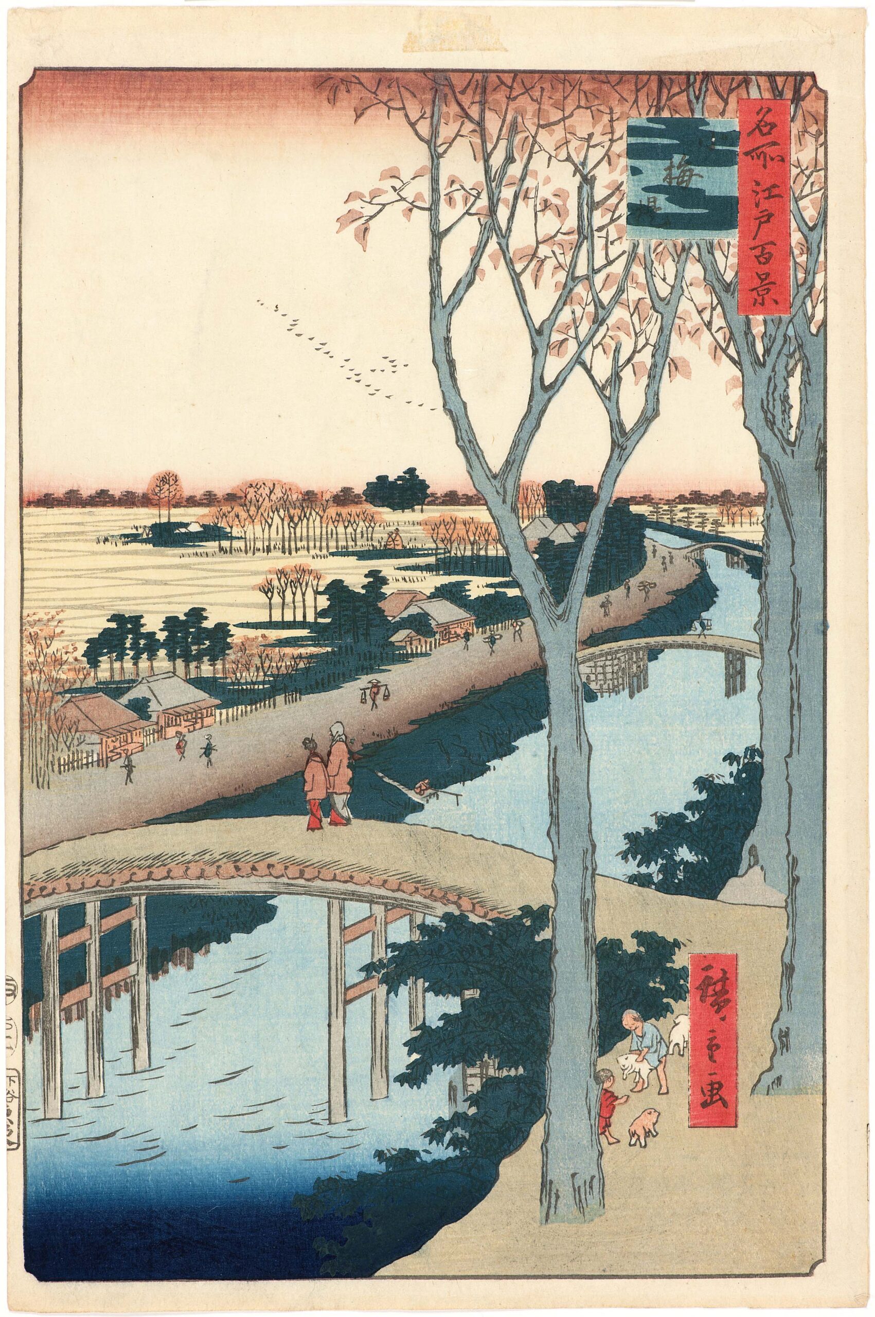
“Koume Embankment” by Andō Hiroshige, #104 in the series “One Hundred Views of Edo,” 1857, woodblock print. Collection of the Kalamazoo Institute of Arts; Director’s Fund, 1975/6.35.
Among the 40 objects on display, one of the oldest is a Sixteenth Century Chinese hanging scroll, circa 1530. This blue-green landscape utilizes azurite and malachite pigments to create a surreal, gem-like scene of palaces and temples perched precariously on mountainsides. Such works were intended to depict a serene state and a closeness to the celestial realm, using blue to bridge the gap between the earthly and the divine.
The color blue has multiple connotations or emotions ascribed to it. When feeling sad, people say they “have the blues.” The color blue has often been used to convey atmosphere, the serenity of the sky. Or, when associated with water, it can symbolize life. In Japanese kabuki theater, blue makeup indicated a character was dead, vengeful or a spirit. In Japanese woodblock prints, blue garments could indicate a woman’s marital status as well as a sense of purity, honesty and calm. In both Chinese and Japanese cultures, the color symbolizes technical skill, rarity and prestige.
More than a color, blue can be seen as a throughline in art history, connecting artists, ideas, cultures and materials across time and place.
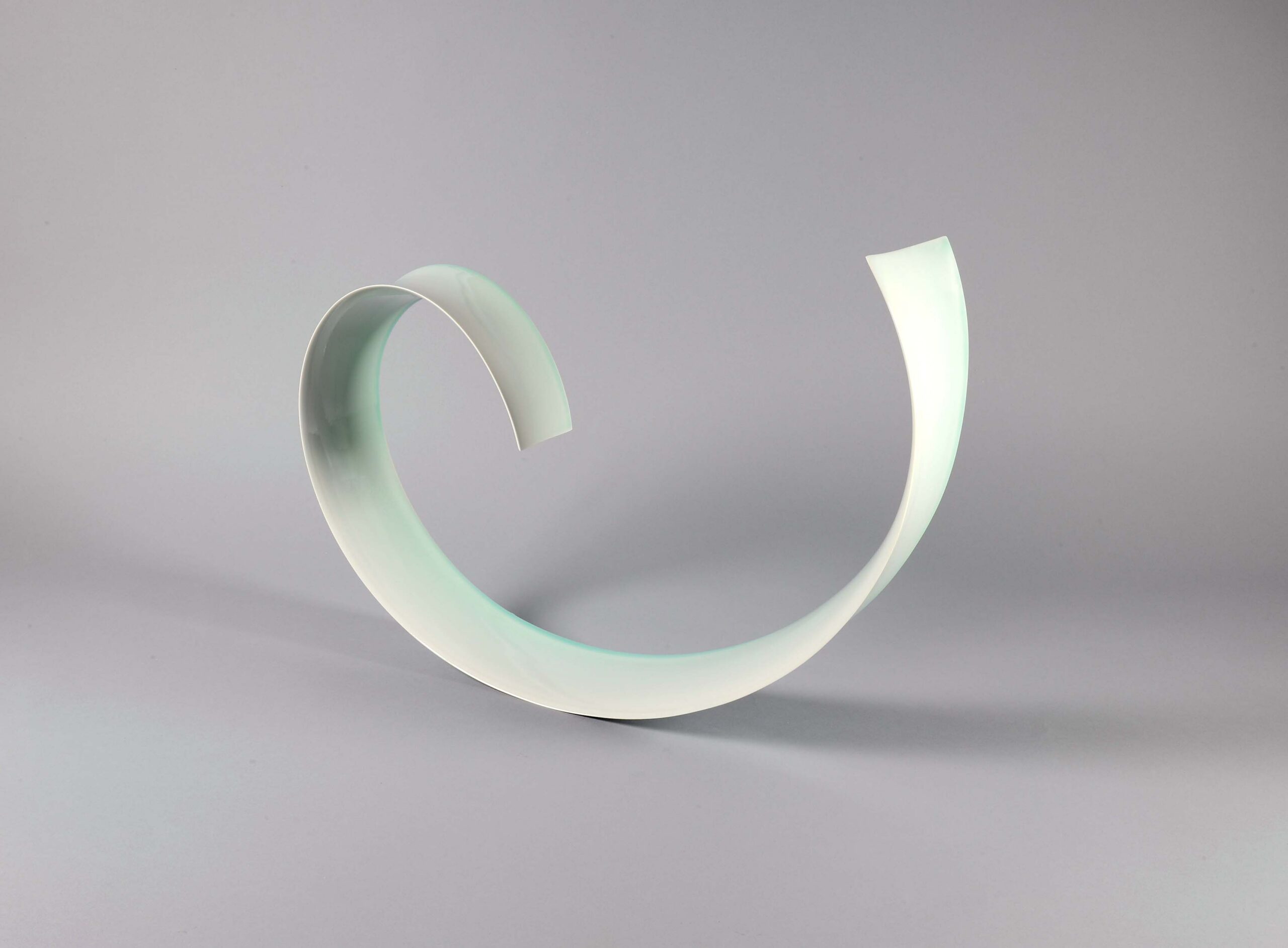
“Oroshi (Wind blowing down from mountain)” by Satoshi Kino, 2016, porcelain. Collection of the Kalamazoo Institute of Arts; Joy Light East Asian Art Acquisition and Exhibition Fund, 2018.45.
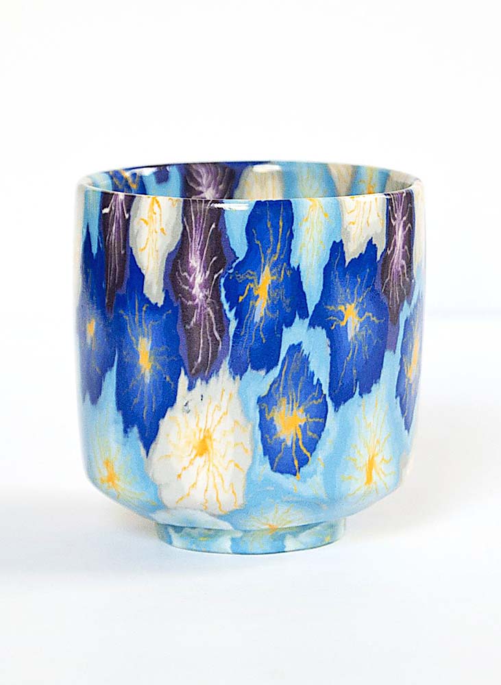
Contemporary artists continue to find new meanings in the hue. Satoshi Kino’s porcelain sculpture “Oroshi” employs a pale blue glaze to capture the essence of oroshi, the Japanese term for a strong and cold wind blowing down from slope of a mountain. Meanwhile, Barbara Takenaga’s abstracted oil paintings use blue to evoke deep sea or celestial space — realms that are just out of human reach but universally drawing viewers into infinity.
The late artist Haku Maki (born Maejima Tadaaki) created a print series in 1969 to complement 21 ancient poems that had been translated into English for a book. He is well known for taking Japanese kanji characters and creating his own typography, dubbed “Maki-created kanji.” A print of “Poem 69-61” is part of the exhibition and features a deeply chiseled woodblock and cement molds. This technique allowed him to create deeply raised reliefs in the paper to create a nearly three-dimensional image. One of Ransbottom’s personal favorites in the exhibition, this print entered the museum’s collection a few years ago. “I just love it, it’s really vibrant and a really deep blue,” she said.
Asian artworks typically have been restricted to the museum’s Joy Light Gallery, and that space allows for only about 30 to 40 objects to be shown. This exhibition offers viewers a more comprehensive view and brings out several new acquisitions as well as artworks that have not been shown in more than a decade. “There will be folks that are maybe finding old favorites again or experiencing the works for the first time,” Ransbottom shared. “And even if they’re not into the history or interested by global trade and the exchange of ideas and materials. I just would love them to enjoy the show and maybe find an artist or a media that they didn’t explore before.”
The Kalamazoo Institute of Arts is at 314 South Park Street. For information, www.kiarts.org or 269-349-7775.